Data visualizations are a bridge between science and art – join us to find out more!
We all encounter data visualization, even though we may not be aware of it. Just think of all the applications in smartphones. We monitor, for example, our daily activity, the fuel consumption in the car, the structure of our expenses in internet banking, or we just need to decide how to dress for work in the morning. A simple but engaging visual can help us to get a quick overview of any situation.
In the following months, we have prepared a program that will guide the participants from the basic procedures of data visualization to its practical use within an artwork.
What to expect?
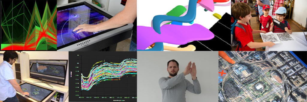
In the first lecture, we will go through the basic principles of visual data presentation and reveal its intersection with visual art and design. Together with the lecturer Matej Novotný, we will introduce some procedures and popular tools. We will discuss real works across various media, from broadcast, through spatial to audio and interactive. Practical workshops focused on data and user (qualitative) research will follow. We will also look at the procedures associated with preparing and implementing media art interventions in public space.
Data visualization is not just about graphs
It is not easy to interpret all the data we gather in today’s fast and connected world. Data visualization gives us a clear idea of the information by putting it into a visual context through quick-to-understand images, maps, or graphs. Thanks to this, we can get an insight into a complex phenomenon, analyze situations, or predict a development faster. It enables us to present data in such a way that data analysts and anyone using it in decision-making can work with them more effectively.
They say data visualization is the art of finding in numbers what is not visible at first glance – telling a story, looking at the world from a new perspective. This feature has made data become a material that artists and designers are working with more and more often. They make the invisible visible through works of art, using innovative data visualization techniques to show the viewer something that numbers alone cannot.
Why Creative Data?
Košice is a university city with a strong representation of artistic and technical disciplines. The ambition of the Košice 2.0 project is to connect these two areas and create space for synergies in our city. One such opportunity will be the lectures and workshops for everyone interested in data, technology, and media art.
The series of events called Creative Data aims to offer participants a wide range of skills needed to work with data, using both creativity and digital technologies. Together with data experts, we will gradually look at how to present data to enable citizens to understand phenomena and processes in the city through infographics, visualizations, artworks, and interventions.